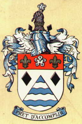

For many years Nuneaton Borough used the official town crest on their shirts, programmes and merchandise.
The blue and white waves, refer to the ancient name of the town ‘Etone’, town by the running water, in allusion to its position on the banks of the River Anker. The black lozenges refer to the coal industry. The ermine cinqufoil is from the arms of Robert de Beaumont, Earl of Leicester, who in the reign of King Stephen endowed the Priory of Nuns whence the town derived the first part of its name. The priory was dedicated to the Virgin Mary, to whom the fleurs-de-lys allude.
The bear’s arm links to the arms of the Warwickshire County Council and the mural crown is a common civic symbol.
The motto, (PRÊT D’ACCOMPLIR – Ready to Achieve), is appropriate to a progressive town, but is historically that of the Aston family, former landowners of much of the Borough.
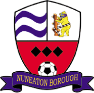
This interesting crest of Nuneaton Borough was in fact introduced as recently as August 2000. It came about as a result of a competition amongst the local community to design a new crest / badge for the club and is now featured on all team kits and club leisure wear and stationery.
The bulk of the crest – a shield – is divided into three segments:
The top left segment displays two blue wavy lines which represent the two main rivers that run through Warwickshire (the River Avon and the River Anker).A bear and staff can be seen in the top right segment of the shield. This is the county emblem of Warwickshire. In the large lower segment, three black diamonds represent the three old mines / coal pits to be found in Warwickshire.
Finishing off the crest is the club name, displayed on the lower banner, and a football, representing the sport played.
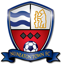
When the club reformed in June 2008, as Nuneaton Town, the badge was slightly amended with the bear & ragged staff image simplified and the team name re-worded accordingly.